


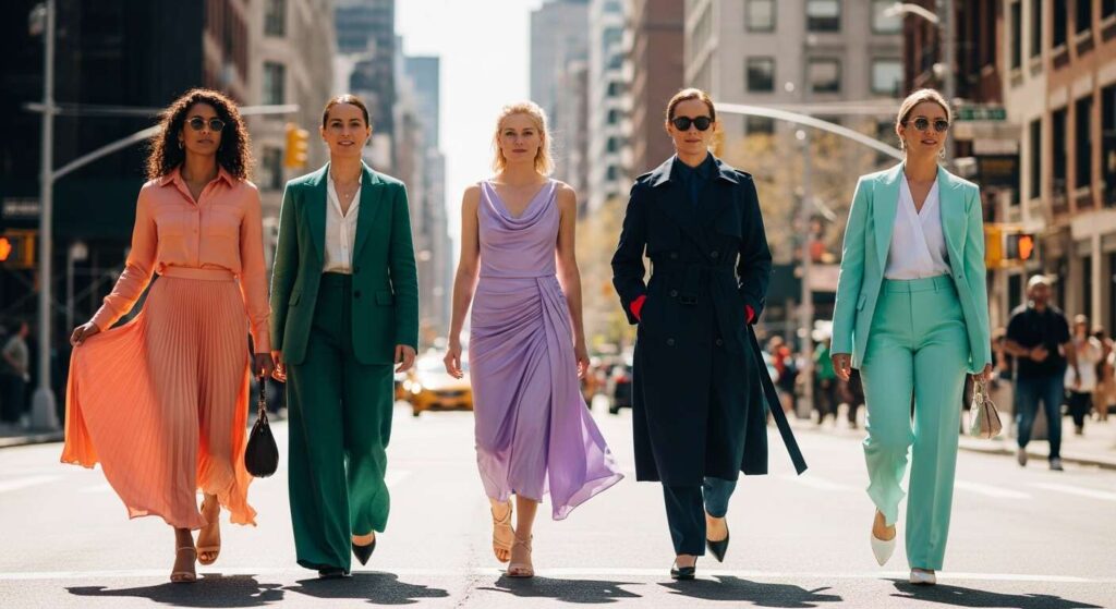
Fashion insiders are already setting their sights on the colour palette that will define the warmer months ahead, and the predictions reveal a striking balance between vibrant energy and sophisticated subtlety. From electrifying brights to nature-inspired tones, the coming season promises a refreshing shift in how we approach our wardrobes. The emphasis lies on mood-enhancing hues that invite personal expression whilst remaining wearable for everyday life. Designers are embracing bold statements alongside softer neutrals, creating opportunities for experimentation with texture, layering, and proportion. Whether you gravitate towards daring chromatic choices or prefer understated elegance, the emerging trends offer something for every style sensibility.
The essentials for spring 2026: must-have colours according to experts
A palette of contrasts
The upcoming season showcases a fascinating duality in colour direction. On one hand, softness prevails through shades like dusty rose paired with camel tones, offering a sophisticated alternative to previous seasons’ more saturated pinks. These combinations work harmoniously with grey and dark brown, creating ensembles that feel both contemporary and timeless. On the other hand, vibrant hues demand attention, with sunny yellow, bright red, and chartreuse emerging as key players on the runways.
Designer perspectives
Major fashion houses are championing energetic tones that signal optimism and vitality. Bright blue and emerald green feature prominently in collections, reflecting a collective desire for colours that elevate mood and spirit. This approach represents a deliberate move towards wearable boldness, where statement shades can be incorporated into practical, everyday outfits rather than reserved exclusively for special occasions.
The art of colour combination
Experts recommend a strategic approach to mixing these diverse hues. The general guideline suggests limiting combinations to three colours:
- A dominant colour that anchors the outfit
- A secondary colour providing depth and interest
- An accent colour adding visual punctuation
This formula ensures cohesion whilst allowing for creative expression. The interplay between soft neutrals and vibrant accents creates opportunities for personalisation, enabling individuals to adapt trends to their unique aesthetic preferences. As we explore the specific shades dominating the season, this foundational understanding of colour harmony becomes increasingly valuable.
Fuchsia pink leading the trends
The evolution of pink
Fuchsia pink emerges as a standout shade that bridges the gap between playful exuberance and sophisticated elegance. This particular tone offers more depth than its predecessors, with a richness that translates well across various fabrics and silhouettes. Unlike previous iterations of pink that leaned heavily towards sweetness, fuchsia carries an assertive quality that makes it suitable for both casual and formal contexts.
Styling fuchsia effectively
The versatility of fuchsia pink lies in its ability to serve multiple roles within an outfit. When used as a dominant colour, it creates immediate visual impact. As an accent, it injects energy into neutral-based ensembles. The shade pairs exceptionally well with:
- Crisp white for a fresh, clean aesthetic
- Navy blue for sophisticated contrast
- Soft grey for modern minimalism
- Metallic gold for evening glamour
Fashion insiders suggest incorporating fuchsia through accessories initially, allowing for gradual confidence-building before committing to larger garments. This approach makes the trend accessible to those who might feel hesitant about embracing such a bold chromatic choice. The shade’s intensity naturally draws the eye towards equally powerful hues that define the season.
The return of Klein blue: an ode to intensity
A colour with heritage
Klein blue makes a triumphant return, bringing with it a sense of artistic gravitas and visual depth. This particular shade of bright blue carries cultural significance whilst feeling thoroughly contemporary. Its intensity creates a striking presence that works across various garment types, from structured tailoring to flowing fabrics. The colour’s ability to maintain vibrancy without overwhelming makes it particularly appealing for those seeking statement pieces with longevity.
Incorporating Klein blue
The richness of Klein blue demands thoughtful styling consideration. It functions beautifully as a monochromatic choice, where varying shades of blue create sophisticated tonal dressing. Alternatively, it pairs effectively with:
- Warm camel and tan for balanced contrast
- Bright white for crisp definition
- Soft pink for unexpected harmony
- Black for dramatic impact
Texture plays a crucial role when working with this intense hue. Designers are showcasing Klein blue in varied materials including airy lace, structured denim, and fluid silk, each interpretation offering distinct aesthetic possibilities. The colour’s boldness naturally complements the season’s other nature-inspired tones.
Emerald green: the nature-inspired hue that captivates
The appeal of emerald
Emerald green represents the season’s connection to the natural world whilst maintaining a luxurious quality that elevates any ensemble. This jewel tone carries depth and richness that translates beautifully across seasons, making it a worthwhile investment piece. The shade evokes both vitality and sophistication, bridging casual and formal dressing with remarkable ease.
Styling strategies
Emerald green’s versatility allows for multiple approaches. As a head-to-toe colour, it creates memorable impact. When used selectively, it adds visual interest without overwhelming. The shade harmonises particularly well with:
| Complementary Colour | Effect Created |
|---|---|
| Dusty rose | Romantic and modern |
| Navy blue | Classic and refined |
| Warm brown | Earthy and grounded |
| Gold metallic | Opulent and festive |
Fashion experts recommend considering emerald in varied textures, from smooth satin to textured knits, each offering distinct visual appeal. The colour’s natural richness provides an excellent foundation for exploring the season’s brighter, more energetic tones.
The vibrant glow of lemon yellow
Sunshine in fabric form
Lemon yellow brings undeniable optimism to the seasonal palette, offering an instant mood lift through its sunny disposition. This particular shade of yellow leans towards brightness without veering into harshness, creating a wearable option for those seeking energetic colour choices. The hue’s cheerful character makes it particularly suited to the transitional nature of spring, when lighter, brighter tones feel most appropriate.
Making yellow work
Successfully incorporating lemon yellow requires consideration of proportion and placement. Small doses create visual punctuation, whilst larger applications make bold statements. The colour pairs effectively with:
- Crisp white for fresh simplicity
- Soft grey for modern balance
- Denim blue for casual ease
- Black for graphic contrast
Texture and fabric choice significantly influence how lemon yellow appears. Lightweight materials enhance its airy quality, whilst structured fabrics lend sophistication. Accessories in this shade offer an accessible entry point for those building confidence with brighter colours. This vibrant tone naturally leads towards equally refreshing aquatic hues.
Opt for turquoise for a refreshing look
The allure of turquoise
Turquoise closes the seasonal colour story with its refreshing aquatic quality, evoking clear waters and open skies. This blue-green hybrid offers unique versatility, reading as both cool and warm depending on surrounding colours. The shade carries a vacation-ready appeal whilst remaining sophisticated enough for professional contexts when styled appropriately.
Styling turquoise effectively
The complexity of turquoise allows for creative styling approaches. It functions beautifully within monochromatic schemes using varying shades of blue and green. Alternatively, it creates striking combinations with:
- Coral and peach for tropical vibrancy
- Chocolate brown for unexpected richness
- Ivory for soft elegance
- Fuchsia pink for bold maximalism
Fashion insiders suggest experimenting with turquoise across different garment types, from flowing dresses to structured blazers. The colour’s inherent freshness makes it particularly suitable for transitional dressing, working effectively in both lightweight and mid-weight fabrics. Its presence in the seasonal palette reinforces the overall emphasis on mood-enhancing colour choices that invite personal interpretation and creative expression.
The colour landscape for the upcoming season presents a carefully curated selection that balances vibrancy with sophistication. Fuchsia pink, Klein blue, emerald green, lemon yellow, and turquoise each offer distinct aesthetic possibilities whilst working harmoniously together. These hues reflect a broader shift towards mood-enhancing choices that prioritise both wearability and personal expression. Whether incorporating these shades through statement pieces or subtle accents, the key lies in experimentation and understanding how colours interact within your existing wardrobe. The emphasis on varied textures and thoughtful proportion creates additional opportunities for creative styling, ensuring these trends remain accessible across different style preferences and practical needs.